

When reaching the end of my first design iteration for the film finder app, I already felt as though I hadn't solved the main user pain-point of making it easier for users to find things to watch. This was confirmed later by a Usability study conducted at the end of the first design where the main takeaway was that it was confusing to use.
I wanted to really focus on creating an experience that made it easier for users to choose what to watch, and needed to come up with a better UI solution.
Since I'm already revisiting this design, I thought it would be the perfect opportunity to push the boat out on my brand and logo design too. (Although I mainly did this for fun, I thought creating my own brand identity would help me to centre in on the best possible solution to the user problem, as it would help with directing a general UI design system.)

Here is a quick brief I wrote up to orient my initial research and brainstorming.
As you can see I wanted to keep the user front and centre, even at this stage, by using the persona I had generated based on my previous user research. I also wanted to list through the apps competition, I started with direct competition, with the main goal of generating ideas that would solve my main goal listed above. However, it was only when I started to consider very loose competition, being TikTok and Instagram that lead me down a specific UI route.

Although it doesn't look like much at first glance, this piece of paper gave me the direction and overall theme that I wanted to represent through my branding, logo and UI.
I started by brainstorming around 25 words that I associated with Films, TV, streaming services, and so on. Once I had done this, I chose 3 words I wanted to develop further, those being "Immersive", as I felt this was a good describer of the feeling people have when watching a really good Film or TV show, "Relax" for the obvious reasons, and "Recommended" for its constant use throughout streaming services. I then dived deeper into these three words to range from the abstract to the obvious in order to get the most I possibly could out of them.
I finally had 4 words that I wanted to write in bold, block capital letters over every screen, piece of paper and post it note that i would use in my future designs, those words being,
1) "Lagoon" - I came up with this based on the prior word "Immersive", I felt "Lagoon" was a good fit as water in general immerses you, and a Lagoon is a calm and tranquil body of water. All of these emotions associated with this word made me feel like it was a perfect start for my branding.
2) "Geometric" - Geometric patterns are repetitive and familiar, and familiarity was something I knew I needed to create in order solve my main goal, as well as to make the user feel relaxed and comfortable when using the app.
3) "Mirror" - This could have also been "Reflections", and I felt as though this was a good metaphor for recommendations, as any good recommendation is a reflection or mirror of the users personality.
4) "Frog" - I know this is a bit rogue, and I didn't really develop this thought further than a single Logo design, but, I'm glad something this abstract got this far through the process as I really didn't want to box myself into rigid ideas from the start. ( also I had fun drawing the wizard frog you'll see soon).

This is where the real fun started for me.
As you can see, not all logo sketches were created equal, but I really enjoyed coming up with every single idea that I had.
My goal was to generate around 25 designs in under an hour, I then went over all of the designs and selected the few I wanted to develop further.
As you can see, my favourites have a lot in common. The idea of having a rolling wave to represent the theme of water I wanted was consistent amongst my designs, as well as the triangular play logo to bring in some geometrical shapes, and it being a very well known symbol relating to watching media.

Researching the aesthetics of competitor logos helped me in my initial ideation.

Using my brainstormed words to direct my Mood board, I wanted to get visual cues of shapes and colours, in order to further inspire my initial logo designs.

Once I had my initial designs down on paper, I took a photo and started to create vectorised versions to neaten them up and add colour in illustrator.
Scanning from left to right you can see the evolution of my designs, in the beginning I think I may have been a bit too excited, and got carried away with colour and complicated shapes.
As you can see in the play logo with the search glass, I tried incorporating a wave design in the play triangle itself. I really pushed this idea to its limits, and I feel that in the end it was just too busy, the designs to the left and the top of the page did reflect an aquatic theme but they were too detailed to be instantly recognisable and were far from familiar and simple.
frustrated I took a step back and tried thinking about my designs from a different perspective, this time with the goal of keeping it simple.
Looking at my previous logo, which was based around utilising the letter "F" for both "Film" and "Finder" I had the idea to go down this route again. And thats how I came up with the logo I used in the end.
By adding the play logo to replace the lower line in the "F", I felt as though I instantly hit most of the brief straight away. It's simple, recognisable, slightly playful, and by contrasting the sharp right angle in the top left of the letter "F" with the large sweeping curves to the bottom and to the right, I felt as though there was just enough wave symbolism to create a calming effect.

I chose to do my own icon design, as I wanted a cohesive icon set that fitted into the design system I wanted to create.
My main goal with the theme of these icons was to have contrasting sharp and smooth corners to reflect both the aquatic wave theme, without losing the strong geometry that would give my icons the recognisability they needed to be effective.
I only had one main challenge to solve with this one, I needed to make the UI less confusing, and the process easier for users to actually find things to watch.
This didn't mean that there weren't other challenges however.
The main challenges I faced along the way were:
. How can I make the UI easier to navigate, whilst also having clear branding.
. How can I convey the visual theme through the logo.
. What information is most important to users.
After getting the results back from my last usability study, it was clear that the UI was too unfamiliar for users to understand. As well as this point, it was also clear that my choice of information hierarchy, or lack of, meant that it was too ambiguous as to what steps users needed to take in order to achieve their main user goal.
This led me to two conclusions.
1) Make the UI familiar - By making the UI familiar to users, it will naturally lead them through the desired user journey, as well as subconsciously making the users enjoy the experience more, as it feels familiar and almost friendly.
2) Make key information clear - In the last design, there were too many steps the user had to undergo in order to reach their goal, so by reducing the amount of inputs per information shown, it would speed up the user journey.
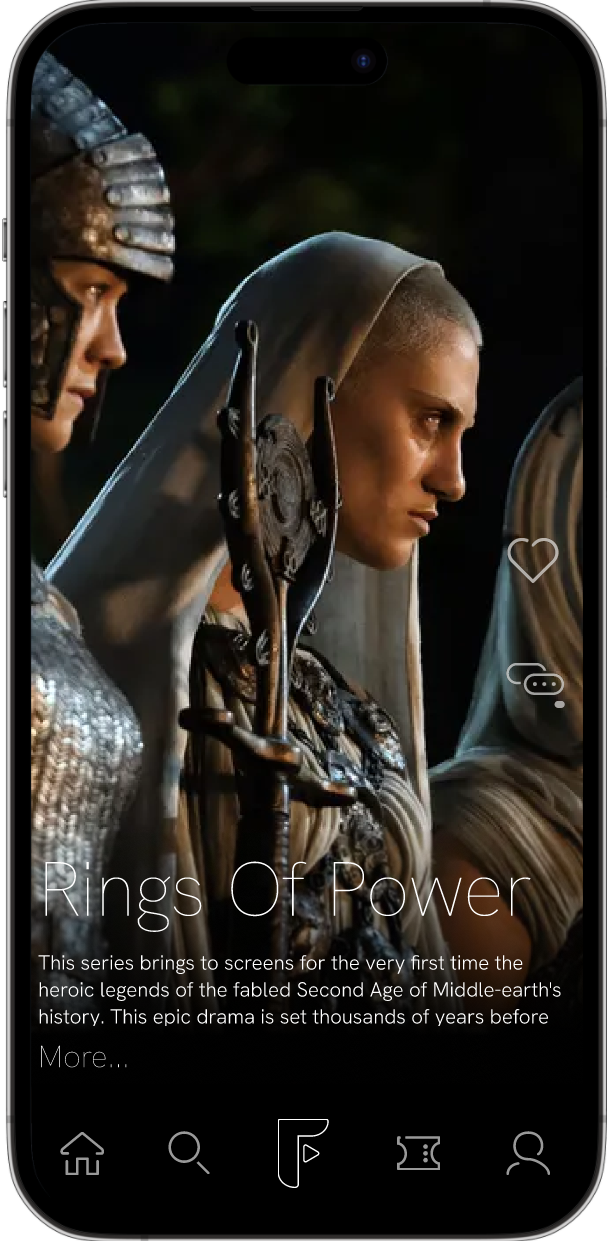
Knowing this, and spending some time brainstorming ideas. I concluded that choosing an Instagram / TikTok style UI style would solve most of my problems. These UI styles would give me the familiarity I wanted, and meant that I could add my own branding and subtle changes to best solve the initial user need.
Having completed this re-design, I am much happier with the UI, proud of the logo design and branding, but more so I feel like I have come up with a much better solution for helping users to find things to watch faster.
I also chose to conduct an A/B test between my old design and new design, in order to see if my re-design was more effective in a few specific dimensions. Those being,
1) Conversion rate - % of people who complete the user objective of reaching the "where to watch" point.
2) Conversion time - Of that % completion for each design, what was the average time it took for completion.
although this test was a limited sample of 5 people, it was clear how much more effective the re-design was at solving the user pain point.
100% of users completed their user journey with no prompting for the re-design, whilst 80% of users completed the user journey with 40% of them needing the prompt of what to do from the homepage.
As for the time for completion, the average time for the re-design was around 1 minute, however due to the features that weren't padded out, such as the user story section, and the lower navigation bar, it was clear that the users were interested in these sections and wanted to explore them further before completing the main user journey. The average time for the original time was around 1 and a half minutes.
I believe that these figures aren't as reflective on the improved efficiency of the design due to the factors stated above for the re-design.
In the future, I would like to pad out the other elements in my design to create a more complete and immersive experience for the user.


Here's the part where you reach out to me so we can start working together, you can send me a message here or you can scroll a bit further down and click the LinkedIn icon to contact me there.
I hope to hear from you soon!
So, Thats it for this page, you can click any of my other case studies below to keep seeing my work, or click the LinkedIn icon to learn more about me.


